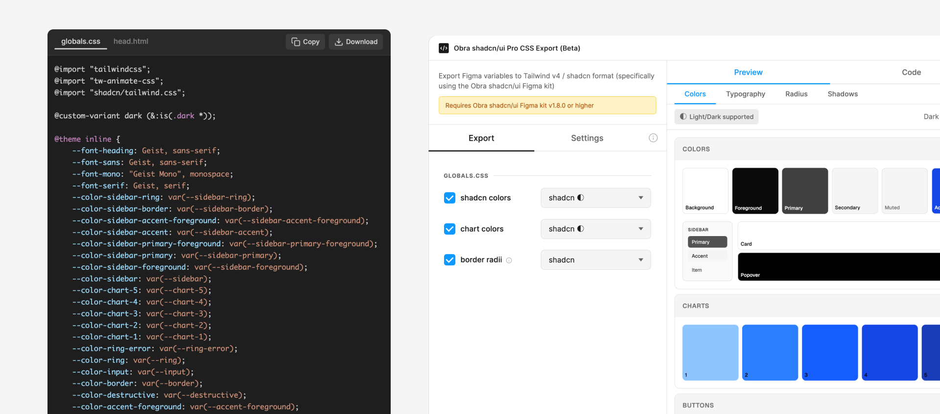
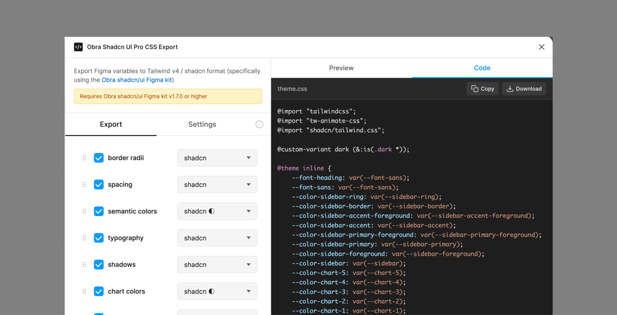
• 1.3.0 released

    We released 1.3.0 of our Obra shadcn/ui kit for Figma.

    You can duplicate the new community file here..

    This is a release that follows quickly from 1.2.0 in which we enhance the theming layer improvements we introduced in 1.2.0.

    The main changes include the following:

    • Add spacing to the theming layer: you can now adjust spacing by adjusting the your_brand collection
    • Scope variables to the right scope, for example, have fill variables

    We have been getting some questions around updating the kit. I made a video last month around this topic, which you find here.

    For the details, please head over to the changelog.

  • 1.2.0 released: new page-based organization + improved theming

    We’ve released the 1.2.0 version of our kit this Saturday evening. You can find the kit via this Figma community link.

    This release focuses on two main aspects:

    1. We reorganized the file with a page-based organization as per popular request - and to work around some performance issues
    2. We revised the theming layer to make it easier to make customizations, with a setup that puts your own brand - literally - in the first place

    We go through the changes in this video:

    As always, find all the release info in our own changelog.

  • Our business model & a few words about other shadcn/ui kits

    We provide our Obra shadcn/ui Figma library for free to the community.

    It is a Figma library that can be used as a base for your shadcn/ui-based projects. Design teams use it to create mock-ups with the official shadcn/ui elements. Some use it as the base for their design system.

    We’ve been getting super positive comments about our kit and are happy design teams worldwide are using our kit.

    We initially released this project in June and it’s been growing steadily so far. We’ve been supporting this Figma file with updates over the past few months as it grew to over 19,000 duplicates at the time of writing.

    In the kit we support Lucide icons, Tailwind v4 colors, and theming (via a default dark and light mode). All shadcn/ui components are faithfully recreated in the kit.

    When the October update came out to shadcn/ui, we jumped on it to provide the necessary updates. We keep our kit up-to-date with shadcn/ui.

    When a user reports a bug or problem, we more than often fix it within 24 hours of the report. We provide a public log of issues on Github as well as provide a place for ideas and discussions.

    Even though the library is a design file, we treat it as an open source project with a changelog that uses semantic versioning (insofar that is possible for design work).

    Comparison to other kits

    Lately we’ve been getting some questions about how our kits compare to other kits, specifically to commercial kits.

    We see the competition heating up in the kit space with new alternatives popping up.

    We see possible clients comparing our kits to some commercial offerings and asking us to compare the kits.

    We understand this is an important business choice when starting a design system project, so we’d like to elaborate on this.

    We think our kit definitely stacks up to the paid options, even though it’s completely free.

    We believe the main benefits that the paid options promote as benefits over our kit are rather limited.

    The main benefits we’ve seen promoted so far include design-to-code plugins; automatic theme adaptation to tweakcn styles; collections of shadcn-based blocks, and a video series teaching how to use the kit.

    Design to code

    For design-to-code, we believe Figma’s official MCP is the go-to solution. We don’t believe individual plugins will match Figma’s native evolution in this space.

    Automatic theme adaptation

    We’ve experimented with automatic theme adaption, but we don’t believe tweakcn themes provide enough depth when it comes to branding a UI kit.

    The number of variables available in shadcn is limited by default (this is on purpose); the idea that you can fully make it work with those variables is misguided. Just go on tweakcn and look at the actual result of a skin - it’s not the result you professionally want.

    We prefer customizing the shadcn/ui kit theme to a brand manually based on a client’s branding guidelines. We analyze the client’s brand and theme the kit acordingly, providing customizations where appropriate. We provide consulting and help around this.

    Pro blocks

    What this feature is: some kits offer ready-made Figma sections, sometimes with a front-end counterpart, often in React.

    We think the “pro” blocks option that some kits provide are not exactly the type of design work we want to promote.

    Most “pro” blocks we see are blocks for marketing websites (e.g. generic looking pricing sections, call to action sections etc.).

    We think shadcn/ui is a great framework for web apps, but using the typical “pro” blocks found for websites in competing kits mostly leads to uninspired design work.

    One competitor describes their generic looking pro blocks as “stunning”. The whole point of shadcn/ui is to provide a base for your design work. The choices made are intentionally neutral so that design teams can build on top of it and make their own choices. How could unskinned, basic looking blocks then be stunning?

    However, aisde from my objections, in some cases, using shadcn/ui “pro” type of blocks can be helpful to whip together a quick landing page. Not every project needs a designer. Not every FAQ or pricing section needs to be reinvented in every project.

    Our kit has a limited number of examples on the Examples page. We believe more examples can help designers help get more out of the kit.

    We aim to expand on the existing examples so kit users have more copy-pastable user interfaces available.

    Just like with most things in our kit, I am not the only person deciding about the direction. We take a community-driven approach. We’d like your opinion on also adding landing page and application blocks to our kit.

    You can chime in here. Are you missing a “pro blocks” feature? What kind of examples are you missing?

    Video tutorials

    Lastly, providing video tutorials is a great idea in our opinion, and something we would like to work on towards the future. We already have videos about our kit, but they don’t follow a structured learning format. We’ve started planning out a video course on how to use the kit.

    However, the backbone of using any Figma library is mostly general Figma knowledge. We offer a commercial Figma workshop where we teach teams how to use Figma, and provide guidance adapted to the designer skill level.

    Our business model

    Our business model is selling consulting, design and development projects as an agency.

    Promoting our free kit leads to client work for our studio, Obra Studio.

    Currently the kit leads to people being interested in our design services and to actual design projects. We can already attribute a sizable amount of revenue to our kit that we expect to grow.

    We’ve made many design systems in the past, either custom or based on other development frameworks such as Material UI. We think that the Obra shadcn/ui file is an example of the type of quality design file we can deliver as a studio. shadcn/ui is not a design system in itself, but can be used as a base for the start of a design system where design and development are based on the same underlying framework.

    Given our business model to grow with our agency, we have no plans to make the kit commercial.

    In the future, we plan to:

    • track the evolutions in shadcn and update the kit accordingly
    • update the kit to support the new featuresin Figma (e.g. the upcoming slot components)
    • fix bugs or issues when reported by the community
    • continue working on our roadmap of changes
    • backport any useful non-client-specific changes we make in our commercial work with the kit
    • keep providing a clear changelog

    Hype vs. substance

    We’re observing that, in the market for UI kits, there is a lot of “hype’ marketing promising you many things. We don’t believe in baseless claims such as promises as “10x design productivity” or “perfect Figma to code conversion”.

    On the design side, we believe if you’re going to do something meaningful with a UI kit like ours, you will still need to put in the hours. To get the best results, you will still need to hire a skilled designer to use the kit as a tool to craft great designs.

    On the development end, some competing kit’s marketing claims might make you believe you don’t need a front-end developer for your project anymore.

    Here, we think the evolutions in AI in terms of getting info from Figma files are strong, but still believe that you need a skilled developer for the job as well to make a correct interpretation between design and code.

    Conclusion

    We believe our kit stacks up to the competition and is a great option.

    With the kit being free, you don’t need to deal with licenses and ever-changing pricing models.

    With the kit having an open source model, you are never locked in. If we make a decision you don’t agree with, you can always fork the kit and continue the work.

    It’s up to us to remain a quality choice so there is no need for this.

    We invite you to check out our kit, use it as you please, and if you some help, we’re here to help as a design & development studio.

  • 1.1.2: Toggle Group fix explanation

    Kit user Josh Rubinstein reported an issue with the Toggle Group in our shadcn/ui kit.

    We believe this was due to a bug in Figma, where layers with a known size would end up with mixed values, even when making a single layer selection. We will report this bug to Figma.

    In 1.1.2, the latest version of the kit, we recreated the component icon behavior in a new component with the exact same name in the exact same place, but technically a new component (with a new component ID).

    If you are encountering this issue, and have already duplicated our kit, we recommend deleting the Toggle Group component from your components and copy pasting the new version of the component (from a freshly duplicated Obra shadncn/ui file) into your existing file.

    This issue is only relevant for versions from 1.1 on, since the Toggle Group component is new since that version.

  • How to update the Obra shadcn/ui kit?

    We’ve recently gotten the question how to update a design file made with our shadcn/ui kit.

    Arjun, who posted the question on our Figma community file duplicated our kit when it was at 0.2.2 and is now wondering how to update to 1.1.

    The biggest differences between those two versions are theming, the introduction of variables for border radii and spacing and several bug fixes. In 1.1 several new components were introduced as well.

    The answer isn’t so clear-cut. Figma doesn’t provide a clear upgrade path for UI kits. A lot depends on how much you customized in the previous version.

    We recommend loading in both libraries, and manually swapping old components for new components. Any customizations to components would have to be re-applied (possibly using the new theming variables).

    We like to mark the components of the old library version as deprecated — we like to do this with a colored background on the components to make it visually clear — and use Figma’s swap library function to swap out the newer versions.

    We’ve made a small video that shows how we would do it.

  • A simpler kit?

    I am sure if you’ve used our shadcn/ui kit, you’ve seen that it got more complex over time.

    What started out as a simple, opinionated kit that was fast to get started with evolved to a bigger kit that houses the complexity of the whole of shadcn/ui.

    Now, this is not a problem per se. Some teams need that power.

    However, we realize some users of our kit do not have advanced Figma expertise or do not want to go as deep in their projects as the kit currently does.

    We’re planning to release a shadcn/ui “light” kit as a companion kit alongside the real kit. This would be a stripped-down version that would be easier to use and understand for most Figma users.

    However, what do we delete? What do we keep in and what should be left out? If you have an opinion, I would like to know it! We’re collecting community input on this topic via this GitHub discussion.

  • 1.1.0 released

    We’ve released the 1.1.0 version of our kit this Sunday evening. You can find the kit via this Figma community link.

    This release focuses on adding the new components from shadcn/ui’s October drop and on fixing some bugs. It also adds a round variant to many components such as inputs and buttons.

    We track the visual look of shadcn/ui. Whenever they make a change, we also make a change to the kit.

    We’re not completely done yet with every new component added, and we’ll be working on more updates the coming time. Specifically the way you can customize inputs needs some more work; we don’t have a round variant for the new button group yet; colors need to be double checked for ghost and outlined buttons in both light and dark modes, and more. An extra pair of helping hands would definitely be welcome, so if you would be enthusiastic to help out improve out kit, drop a note via our contact form.

    As always, find all the release info in our own changelog.

  • New video: editing a rather complex component

    Shadcn teased some new components on X, see this post.

    This led me recording a new video where I use our Obra shadcn/ui kit and show an example of editing an already complex component, to demonstrate how to make an addition to the kit.

    In the video, I am using a combination of plugins to automate manual work: I used Groupify, Propstar, Similayer, as well as the Obra shadcn/ui tools to make an edit to a complex component in just a few minutes.

    By the way, we released the 1.0 version of our kit last Thursday. The kit has now been duplicated over 12,000 times!

    I’d like to repeat our call to action from last time—as we added more features, but in a way still like a simpler kit, we’d love to hear your thoughts. Perhaps different versions of the kit can be offered for different needs. If you have any thoughts on this, please contribute in this discussion.

  • 1.0 released!

    We just released the formal 1.0 version of our kit 🎉! After three months of being in public beta and several changes along the way, we hit 1.0.

    You can find the design file here, on Figma community.

    We take that number seriously as a stable point: since we adhere to semantic versioning (as much as that’s possible for a design file) we will not be releasing any breaking changes.

    The file will stay stable with the variables that we have now, the components that exist. If shadcn/ui itself releases further changes, we will check their nature (addition, deletion, change…) and see how we will update the kit. As always we will ask for your community feedback before making any major changes.

    Today we hit 11,000 duplicates for our kit. We are excited that design teams are trusting our kit to build their foundations on. We’ve heard that teams from Belgium, Mexico, South Korea, the US and Brazil have been using the kit for their app designs. Awesome. If you use our kit, make sure to let us know!

    When we designed this kit, we initially had a philosophy of “do more with less”: we only shipped the colors that were used, we only had 20 or so icons in the kit (the ones actually used) and no dark mode on purpose.

    Based on the feedback of the community, we realised that it’s better to be more feature complete. Over the public beta releases we gradually added features:

    • August 18, 2025 - 0.2.0 - We learned from the community that they would like all Lucide icons and all Tailwind colors straight-up in the library file instead of dealing with the add-ons.
    • September 2, 2025 - 0.3.0 - Added Propstar-based docs for all components.
    • September 4, 2025 - 0.4.0 - We added variables for border radii and spacing.
    • September 8, 2025 - 0.5.0 - The Obra shadcn/ui kit now supports dark mode and theming. We’ve added variables for light/dark mode (and subsequently, themes) to all components.
    • September 15, 2025 - 0.6.0 - We linked to the official shadcn/ui docs in every component

    As we added more features, but in a way still like a simpler kit, we’d love to hear your thoughts. Perhaps different versions of the kit can be offered for different needs. If you have any thoughts on this, please contribute in this discussion.

  • 0.5.0 video + 10 000 duplicates!

    Hi community, we’ve reached the insanely nice milestone of having 10,000 people that duplicated our UI kit. We’re very happy with this milestone! We see that the kit has great momentum with over a thousand duplicates a week. If you are using the kit as the base of your own design system, we’d love to hear from you.

    We’re pretty close to the 1.0 release with a likely release next week, on September 18th. You can find more info in the Road to 1.0 Github issue.

    I just recorded a video about 0.5.0 with the biggest changes. Those are the theming layer and the inclusion of example screens. You can find the video that explains the changes below.

    As always, any community feedback is welcome. The best place to post your feedback is on our GitHub issues page.

  • 0.5.0 released: Theming, dark mode and example screens

    We’ve released the 0.5.0 version of our kit! This is one of our biggest releases so far.

    Highlights of this new version include the inclusion of light and dark mode and subsequently theming variables. This will make it much easier for users of the kit to customize the theme to their liking.

    We’ve improved consistency with shadcn/ui itself, and we’ve fixed some long-standing bugs.

    Next to this, we added example screens to get started with your designs.

    Check out the full changelog here.

    We’ve been shifting the dates for the 1.0 release a few times but with this feature release, we are confident we can call the kit stable very soon. We’re aimign for a release date on September 18, 2025 now.

    Check out the new version on Figma Community.

  • 0.4.0 released (plus: variable plugins for consistency)

    We released the 0.4.0 version of our shadcn/ui kit. You can duplicate the community file here.

    In this release we added border radii and spacing variables. We’re inching closer to 10 000 duplicates. Amazing.

    We also released 2 plugins to help retain consistency in the kit.

    1. Obra Border Radius Variable Fixer
    2. Obra Spacing Variable Fixer

    These are released as general-purpose plugins, which can be used with any design file.

    Check out the video for more details:

  • Obra shadcn/ui tools plugin released

    We created a plugin called Obra shadcn/ui tools that aims to provide tools that make it easier to work with the shadcn/ui kit.

    As a first functionality for this plugin, we provided utilities to make it easier to work with the kit in combination with the Propstar plugin.

    In the latest version of the Obra shadcn/ui kit we added Propstar based docs for all components.

    This tooling helps you to rework components in an easier way when using the kit. With the “de-propstar” command you can remove propstart docs; and with the “post-propstar treatment” command you can automatically position your core component in the right position in the docs.

    Watch the video to learn how it works:

    Curious to try it out? You can view the plugin page here.

  • 0.3.0

    Just a small update. I added PropStar based documentation tables for all components, fixed a minor bug with the Resizable component, and released a new version.

  • Dark and light mode: community input needed

    Following the discussion to add the variables for spacing and border radius, we would like the community’s opinion on adding light and dark mode to the kit.

    This change would implement the theming layer of shadcn/ui along with likely some extra variables for things that can’t be simulated in Figma (e.g. opacity of variables)

    We are also looking for somebody who can contribute this change if it’s voted in.

    Please contribute with your vote here.

    Sponsor the shadcn/ui kit to make new features and maintenance work happen faster

  • Road to 1.0

    Hi all, we’re aiming to release the 1.0 version of the shadcn UI kit on September 12, 2025.

    In order to finalize this version, we would like to have the community input on whether we should include:

    1. border radius and spacing variables (see discussion #51)
    2. semantic/theming layer from shadcn (see shadcn theming docs ) - no thread around this yet
    3. light/dark mode

    When we first created this kit, we used a light approach where we didn’t include all the features so it would be easier to make this kit your own.

    However, from the feedback we’ve noticed that in general, our audience prefers feature completeness over customizability.

    Your input is super welcome on Github to shape the final 1.0 version.

  • Feedback wanted around variables

    Hi everyone, we would like to have some community feedback around adding variables for spacing and border radius in our shadcn/ui kit.

    You can join the discussion and add your thoughts here. We’d like your opinion! Currently, 2 people have voted with a 50/50 split between not adding it or adding it.

    Your opinion matters for the evolution of the kit, as the outcome of this question directly leads to possible work on expanding the semantic layer.

  • 0.2.0 - Icons and colors now bundled

    We listened to the community and bundled all Tailwind colors and all Lucide icons inside of the kit. The add-on files are thus deprecated. This makes the kit heavier on initial publish, but provides more options to design with by default.

    Watch the video:

  • Sponsor this project

    In order for this project to continue as an open source project, we are in need of sponsors.

    Light sponsorship ($25, $50…) will help with the continuation of this project.

    Heavy sponsorship ($1000) can lead to benefits such as:

    • private team consultation about the usage of the kit
    • early access to new versions
    • access to custom components that are built within the same kit

    Currently, we are setting up our Github profile to be ready for sponsorship. The ideas are around this are early.

    Update: the Github sponsor profile is live here.

    If you are interested to talk, shoot me an e-mail: johan@obra.studio .

  • Feedback wanted - Retire add-on kits?

    After some consideration, I am thinking to retire the add-ons and add all the Tailwind colors as well as the full kit of Lucide Icons straight in the kit file.

    I initially thought I would make the kit as lean as possible, but I find myself always adding the colors and the icons for most projects, and it’s a bit of an annoying process. I know exactly how to do it as the kit creator, but I can imagine for others it might be a dealbreaker.

    This decision would make the kit heavier on initial publish — the icon components lead to a slow initial publish time — but also easier to start designing with.

    Any thoughts from the community? Please give your opinion here.

  • Teams using our kit

    I’m happy to report that we’ve heard from several teams, to be exact, that they started using our kit as a base for their system.

    We heard Belgian-based Payflip and Brazil-based Omnismart made the choice to use our kit. Very cool!

    Here is some nice words from Emmanuel Tomiyoshi, product designer at OmniSmart:

    I gotta tell, you saved me time, money and headache. That file is just right what my team have been looking for. Too much advanced. The right techniques. As someone who’s been deep diving on Design Systems and helping software companies to scale their products with multi-whitelabel-themed systems, this is a rare gem.

    We’re actually starting today with your file as our system foundation. I’ve tested FramesX, AlignUI, Untitled UI, you name it. And even shadcn Figma file (I didn’t buy it, but I saw the preview and it didn’t look too much right). After analysing, yours filled the gaps they didn’t.

    Our kit has close to 2000 duplicates on Figma community. We’ve started working on an internal project where we are putting it through its paces and fixing some small issues as we encounter them.

    Awesome!

  • Two new YouTube videos

    We’ve added 2 new videos the videos section. One is about starting a design with the kit; another is about adding components to an existing design and customizing it.

    We are motivated by community requests and having a real conversation about our kit. So if you have any video requests, don’t hesitate to tweet to @wolfr_2 or log your request as a Github issue!

  • 1000!

    We’ve reached over a thousand duplicates for our shadcn/ui kit 🎉!

    In fact, I planned to write this blog post and as of the time of writing the counter is already at 1300 users. Wow!

    Despite this number, we haven’t received that much feedback yet. From my experience with Figma plugins and files, sometimes this number goes up quite quickly, without people actually using the file, just checking it out. It is almost like a “visited” number and not really like a usage number.

    • If you build something with our kit, we would love to see it! Show it off in a new issue at GitHub Issues or tweet to @obra_studio_2.
    • If you have any comment or suggestion, it’s more than welcome at our GitHub Issues.

    Currently, we are planning to add some videos to YouTube to make it more clear how the kit can be used. Check out the existing videos here. These videos will also serve as Figma tutorials. If you have any specific video requests, something that you wanted to know about Figma and never dared to ask, also feel free to put this in the GitHub issue.

  • Effective collab

    There’s been some talk on Github issues and in our private Slack about doing effective collaboration.

    The first phase of building the shadcn/UI kit (roughly the first 50 hours of the project) I did the work myself.

    Then I involved pixel perfectionist Marina to improve it, just inviting her as an editor on our Obra account.

    Gradually we also got feedback from different people - thank you Robert, Jovi, Gavin and Jorre.

    Jorre specifically copied the kit, added some missing calendar-related features, and then linked to a public file with his improvements. This posed me with a problem: how to get his improvements into the original file?

    We idenfitied some different solutions:

    1. Use the Figma swap libraries function - which I’ve been playing with today
    2. Invite everyone who wants to contribute to the the project as a classic Figma Editor and pay for their seat, then work non-destructively
    3. Use a custom script (see this comment)

    There were some side ideas as well:

    1. See if we can leverage the Figma master plugin
    2. Use Figma branching (but that’s reserved for more expensive Figma tiers).

    If anybody from the open source community has some ideas, please chime in on the Github issue!

  • Hello world

    Welcome to the Obra shadcn/ui blog! We will be posting updates to the kit here.