
Icons
Default Icons#
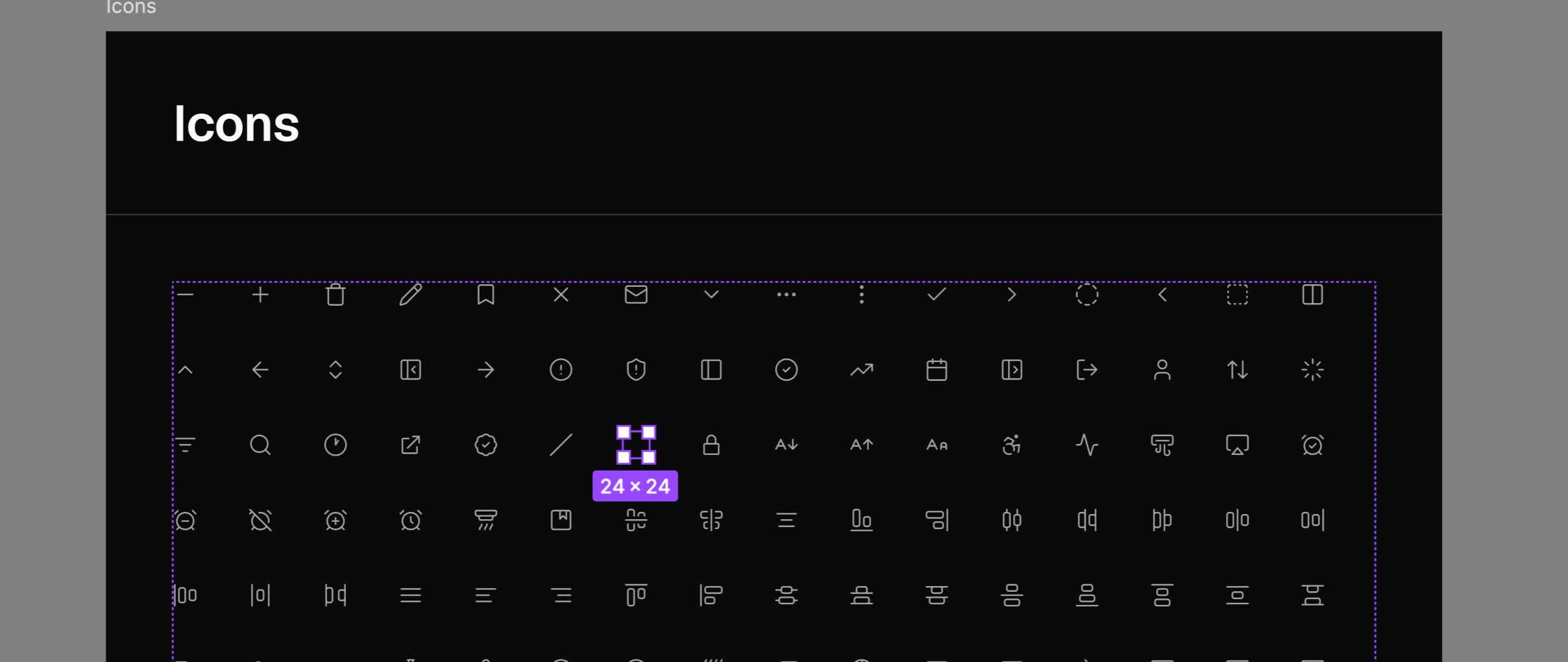
By default, Obra shadcn/ui ships with Lucide 1.0 icons — over 1800 icons — for the main icons, and Obra Icons for the social icons (since Lucide doesn’t ship with any brand icons, and we use the social icons in Pro Blocks).
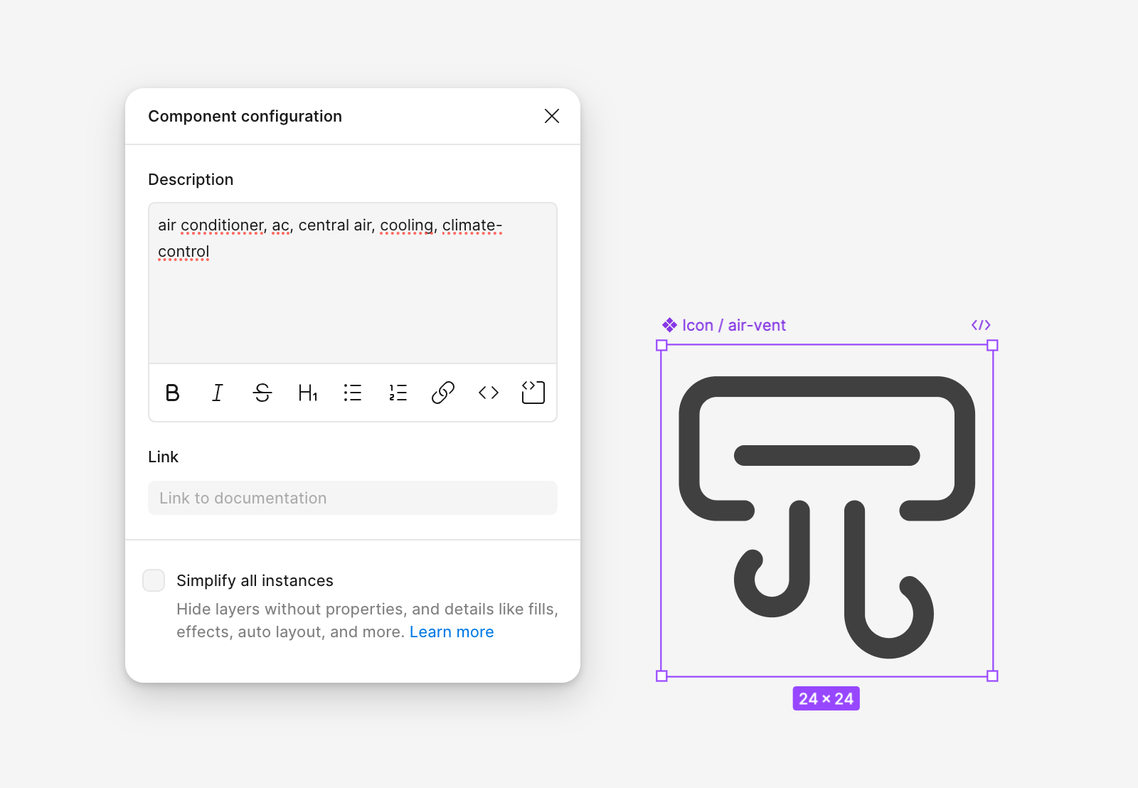
Most Lucide icons are tagged with keywords, which makes it easy to search for and swap in an appropriate icon when replacing icons in components across the kit. Icons default to a 2px stroke width.
Organisation#
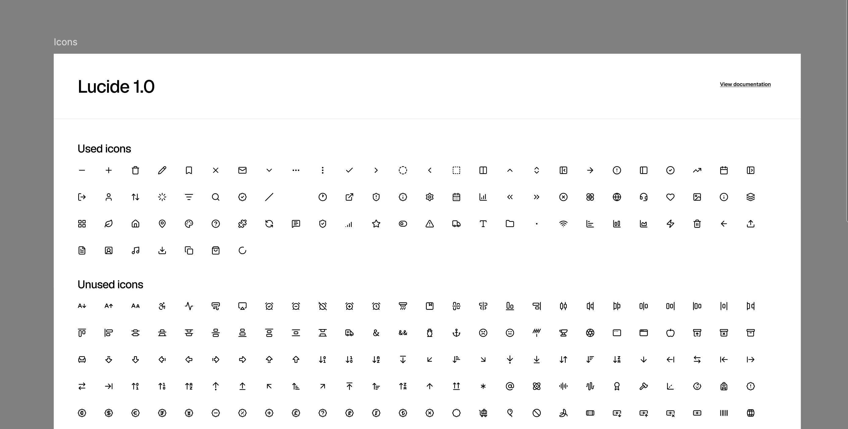
The icons are divided into Used and Unused. This makes it easier to understand which vectors are effectively used in the file. When swapping to a different icon set, we recommend adding the new set as components and then swapping out the internal vectors — this keeps the existing components intact.
Changing Your Icon Set#
There are two paths to change your icon set: manually, using a free add-on file, or automatically, using the Obra shadcn/ui create plugin (Pro only).
Changing an Icon Set Manually#
We provide a free add-on file containing:
- Tabler Icons — 5000+ icons, great for projects needing filled variants. MIT license.
- Phosphor Icons — 3000+ icons. Phosphor offers multiple weights, but we only included the regular weight to keep the file manageable. More info at phosphoricons.com. MIT license.
- Remix Icons — licensed under the Remix Icon license.
- Obra Icons — our custom icon set. More info at icons.obra.studio. MIT license.
Why a separate file?#
We kept these icon sets in a separate community file because adding them to the main kit would make it too large to publish.
Note on HugeIcons#
HugeIcons is available in shadcn/ui create but omitted from our add-on because it has a restrictive license we don’t agree with.
Changing an Icon Set via the Obra shadcn/ui Create Plugin#
Pro customers also have access to the Obra shadcn/ui create plugin — see that page for what the plugin is and where to get it.
In the plugin’s Icons tab, you can swap between Lucide, Phosphor, Tabler, and Remix. Select the 24×24 icon components on the canvas (or frames containing them), choose a target set, and apply — icons are matched by component name and renamed to the equivalent icon in the new set, so your components stay intact. It’s the same outcome as the manual path above, without hand-picking every icon yourself.
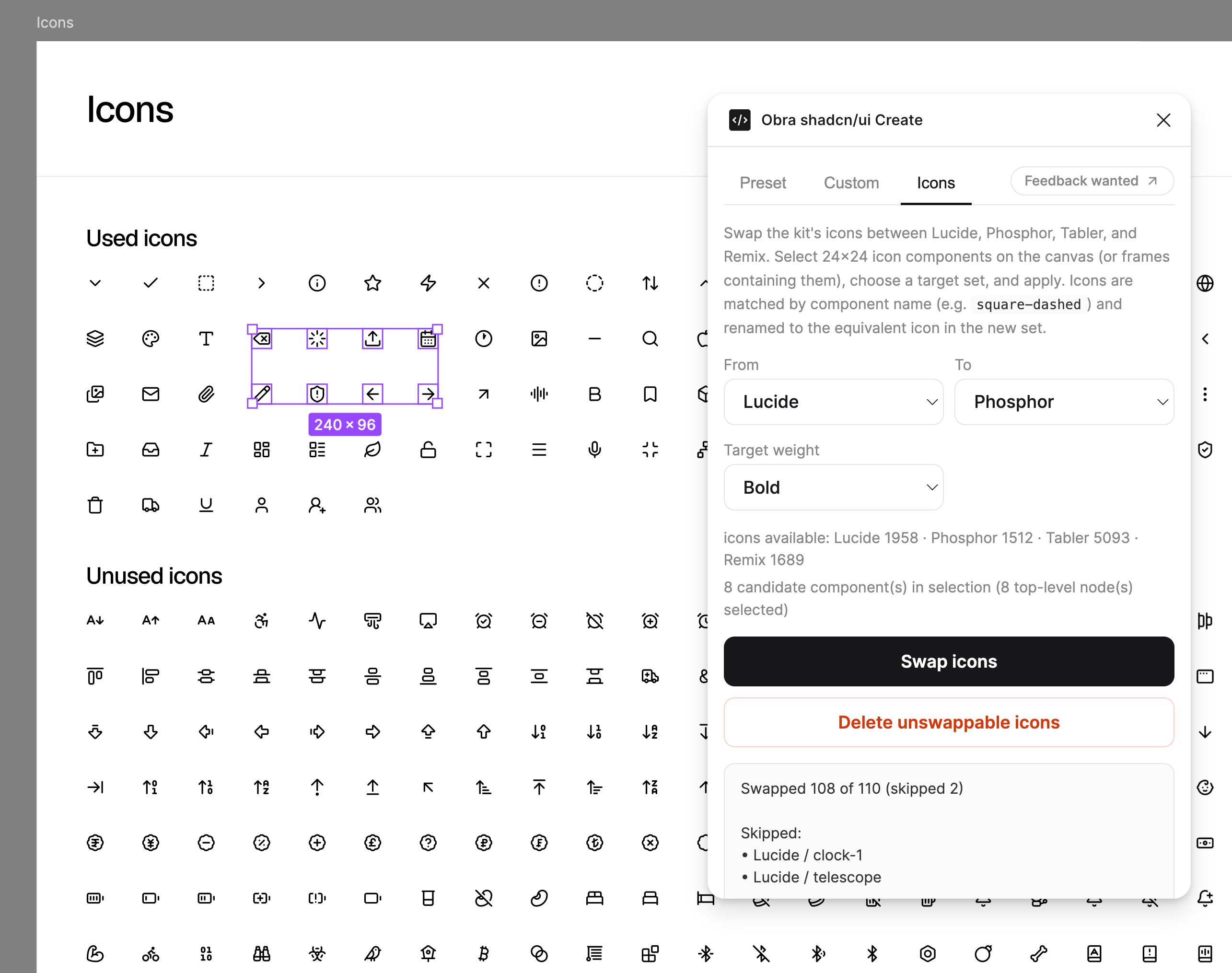
Note: This feature is experimental, and we know the mapping dataset isn’t perfect — it’s currently about 60% complete, built through a community contest we ran to help generate it. Please use this feature with caution.
Legacy docs#
In Community Edition 1.6.0, the icons that are used were sorted on top, so if you wanted to delete icons you didn’t need, you could delete all icons past the blank icon.