

Customizing colors
The fastest path: shadcn/ui Create plugin#
Before diving into the variable collections by hand, consider the shadcn/ui Create plugin.
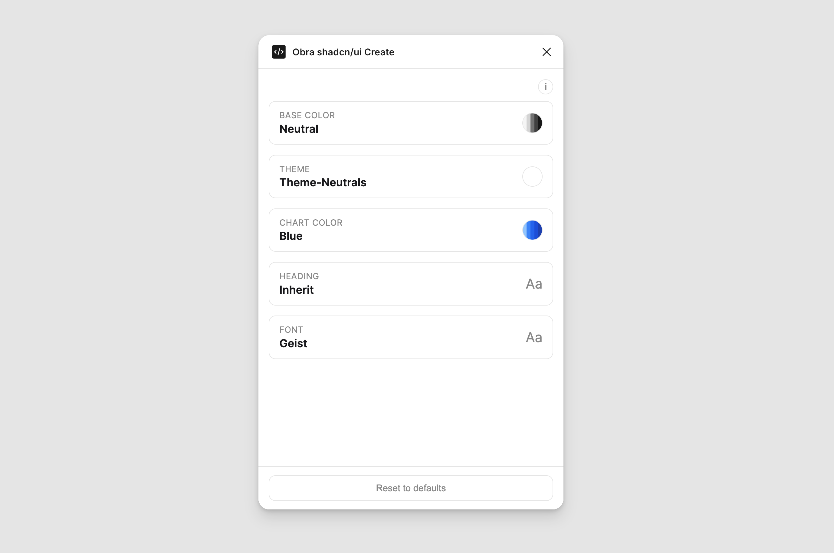
You pick a base color (the kit’s neutral tone — Neutral, Stone, Slate, Zinc, Gray), a theme (the primary/accent direction), a chart color, and optional heading and font choices. The plugin then rewrites the kit’s theme, shadcn colors, and typography collections to match. It does the same variable mappings you’d otherwise build by hand, but in seconds.
A Reset to defaults button restores the original Neutral/black configuration if you want to start over.
When to use it:
- You’re spinning up a new project and want a starting theme that isn’t the default Neutral/black.
- You want to mirror the exact theme you’ve configured on shadcn/ui Create so Figma and code start in the same place.
- You’re exploring different brand directions and want to swap themes quickly without manually remapping variables each time.
When the manual route below is still the right call:
- Your brand color isn’t covered by the built-in scales and you need to add a custom scale to
raw tailwind colors. - You’re tuning individual tokens (e.g., a slightly darker
secondaryfor muted backgrounds) rather than reskinning wholesale. - You want to understand the chain before letting a plugin write to it.
Where to get it#
You can find the plugin on Figma Community.
How to change the primary button color#
The primary button uses the primary token in the shadcn colors collection, which points directly at a Tailwind color scale in raw tailwind colors — for example tw-raw/blue/500.
- Open the
shadcn colorscollection and find theprimarytoken (andprimary foreground). - For both
shadcn(light) andshadcn-dark(dark) modes, pointprimaryat a differenttw-raw/*scale — for example,tw-raw/blue/500in light andtw-raw/blue/400in dark. - If
primary foregroundneeds to contrast the new color, update it too (commonlytw-raw/whiteor a light neutral).
All primary buttons, checkboxes, radios, and focus rings update at once. If none of the built-in Tailwind scales match your brand, add a custom scale to the raw tailwind colors collection and point primary at it.
How to change the kit’s neutrals, destructive color, and chart colors#
The kit’s neutral tone, destructive color, and chart palette are all driven by the theme collection, which shadcn colors references via aliases.
Customizing the neutral tone is simple — every step in theme/neutrals points at tw-raw/neutral/* by default, so swapping the whole scale is really just swapping which raw family it points at:
- Open the
themecollection and find theneutralsgroup. - Swap
tw-raw/neutral/*for a different raw neutral family — the built-in choices are Gray, Mauve, Mist, Neutral (default), Olive, Slate, Stone, and Taupe. - Update the
destructiveandchart colorsgroups the same way, picking whichevertw-raw/*scales fit your brand —destructivedefaults totw-raw/red/*, and the chart slots default to atw-raw/blue/*ramp. - Do this for both
shadcnandshadcn-darkmodes if you want both themes retinted.
You don’t need to touch shadcn colors at all — every token that references the theme collection updates automatically.