

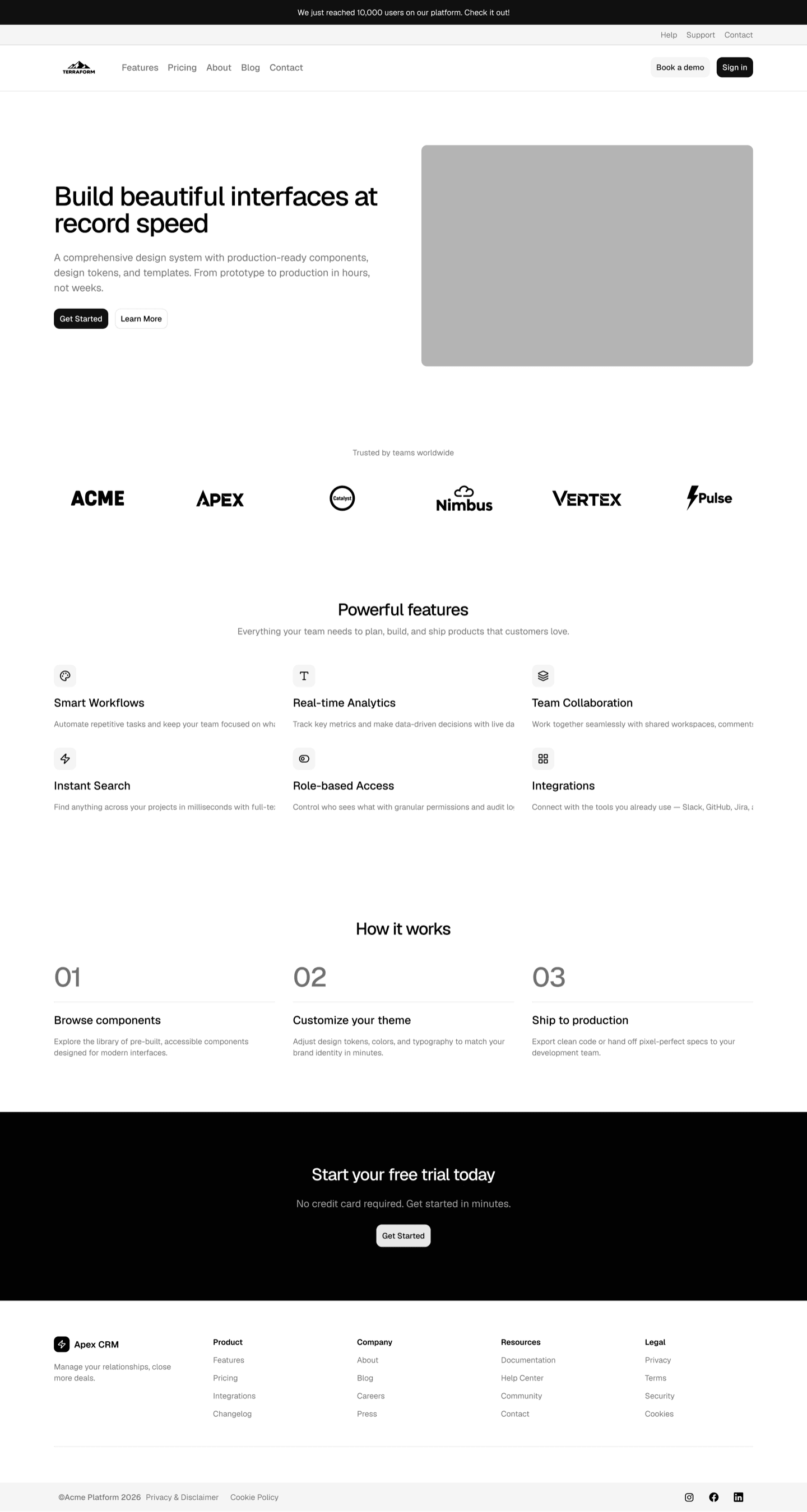
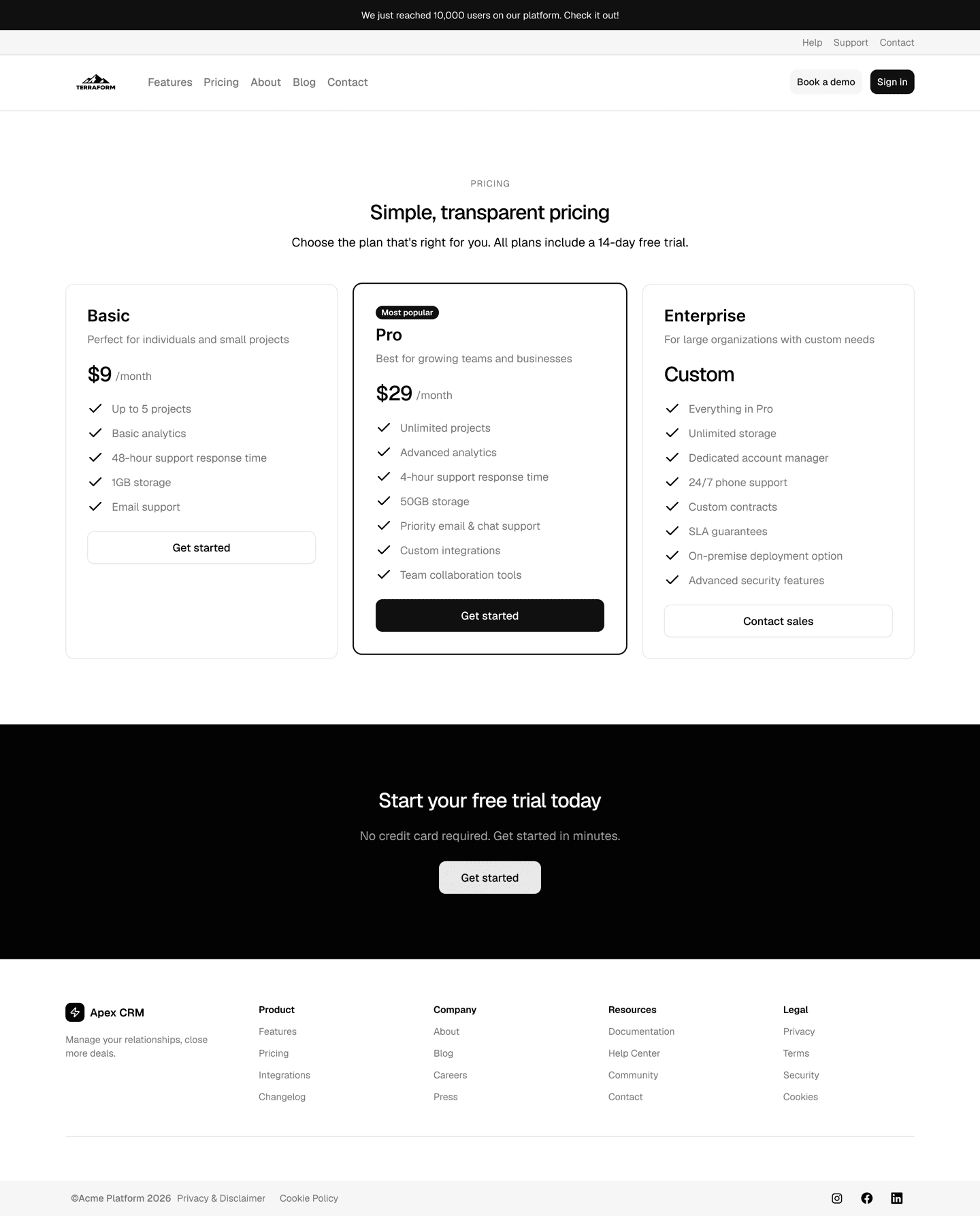
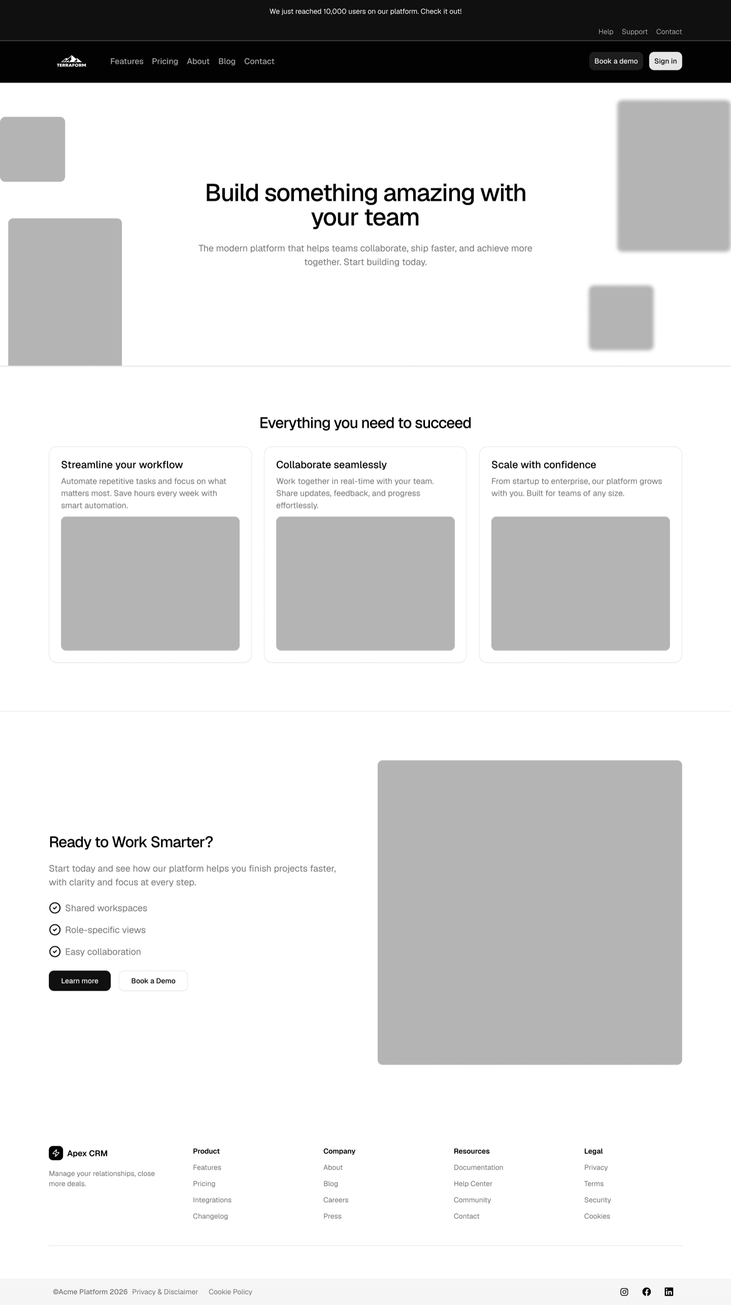
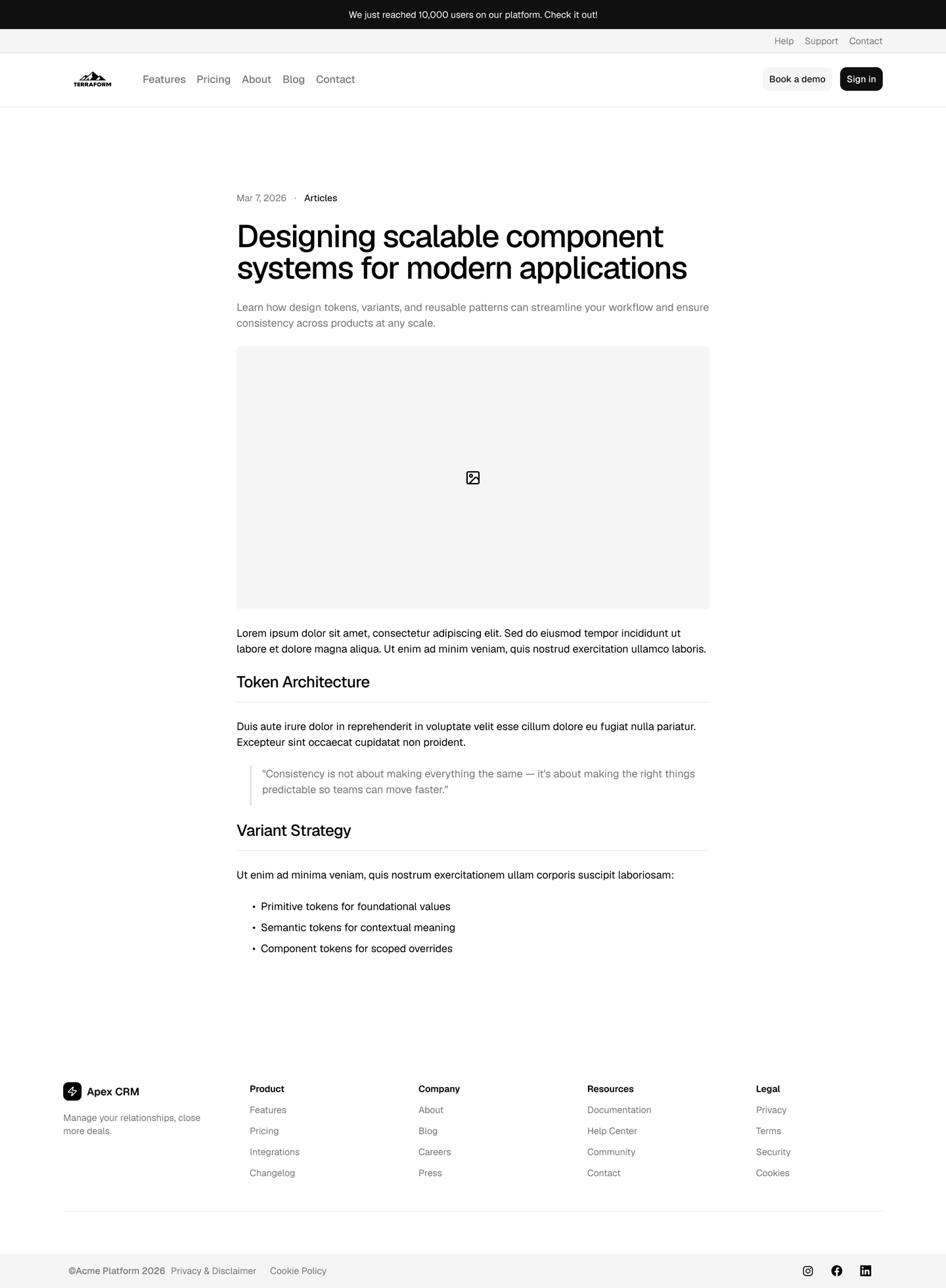
The highest quality shadcn/ui Figma library to design and theme your projects
Obra shadcn/ui Pro is a library for working designers, that contains high quality components built to the highest standards.
Features
Pixel-Perfect Components
Every shadcn/ui component accurately recreated in Figma with deep usage of component properties and slots. Kit available in all styles.
Deep Theming
Customize colors, typography, spacing, border radii and shadows using Figma variable modes — including multi-brand support. Variables follow shadcn/ui's naming 1:1, so designers and developers speak the same language.
Dark & Light Mode
Full dark and light mode support through semantic color variables, with multi-brand theming built in.
React Pro Blocks
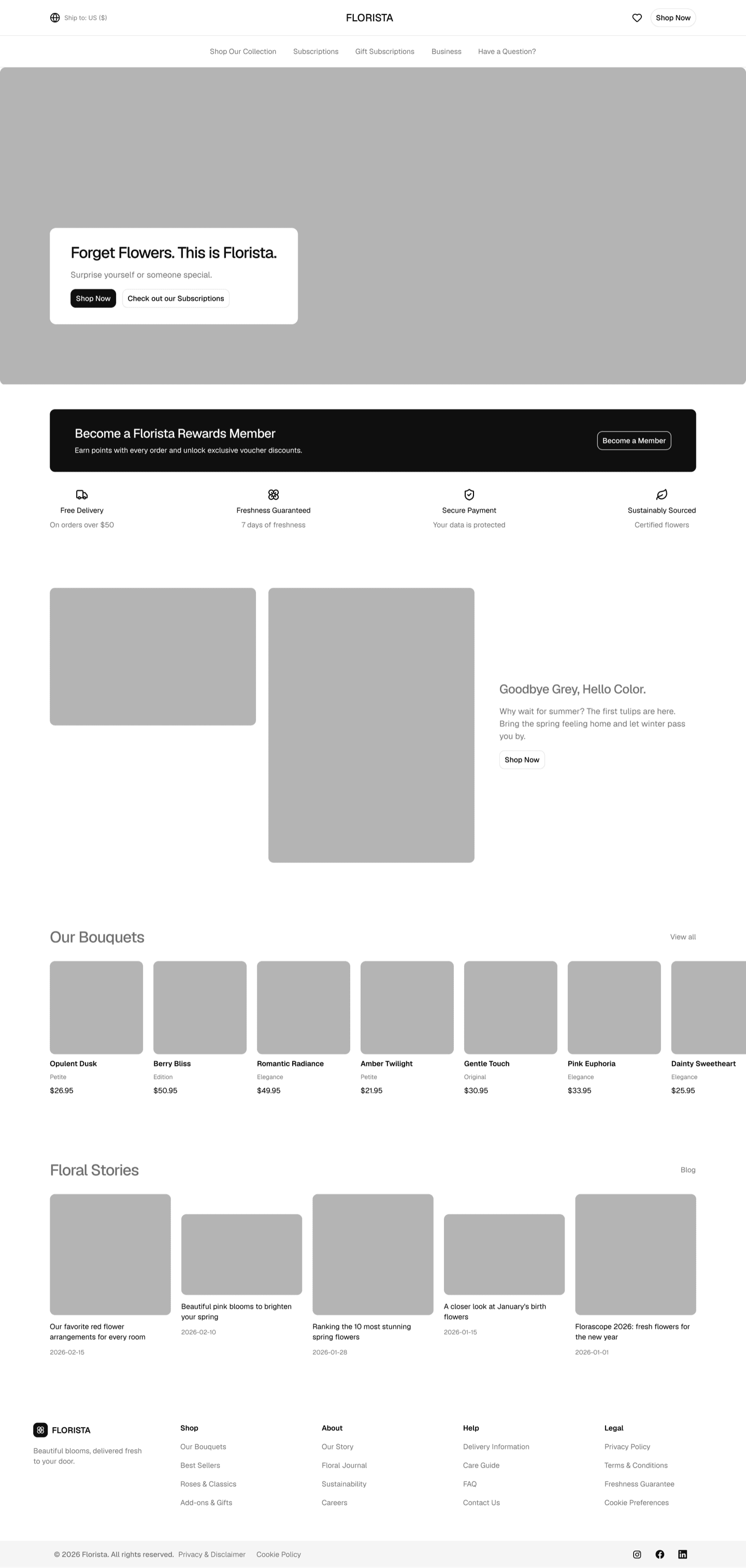
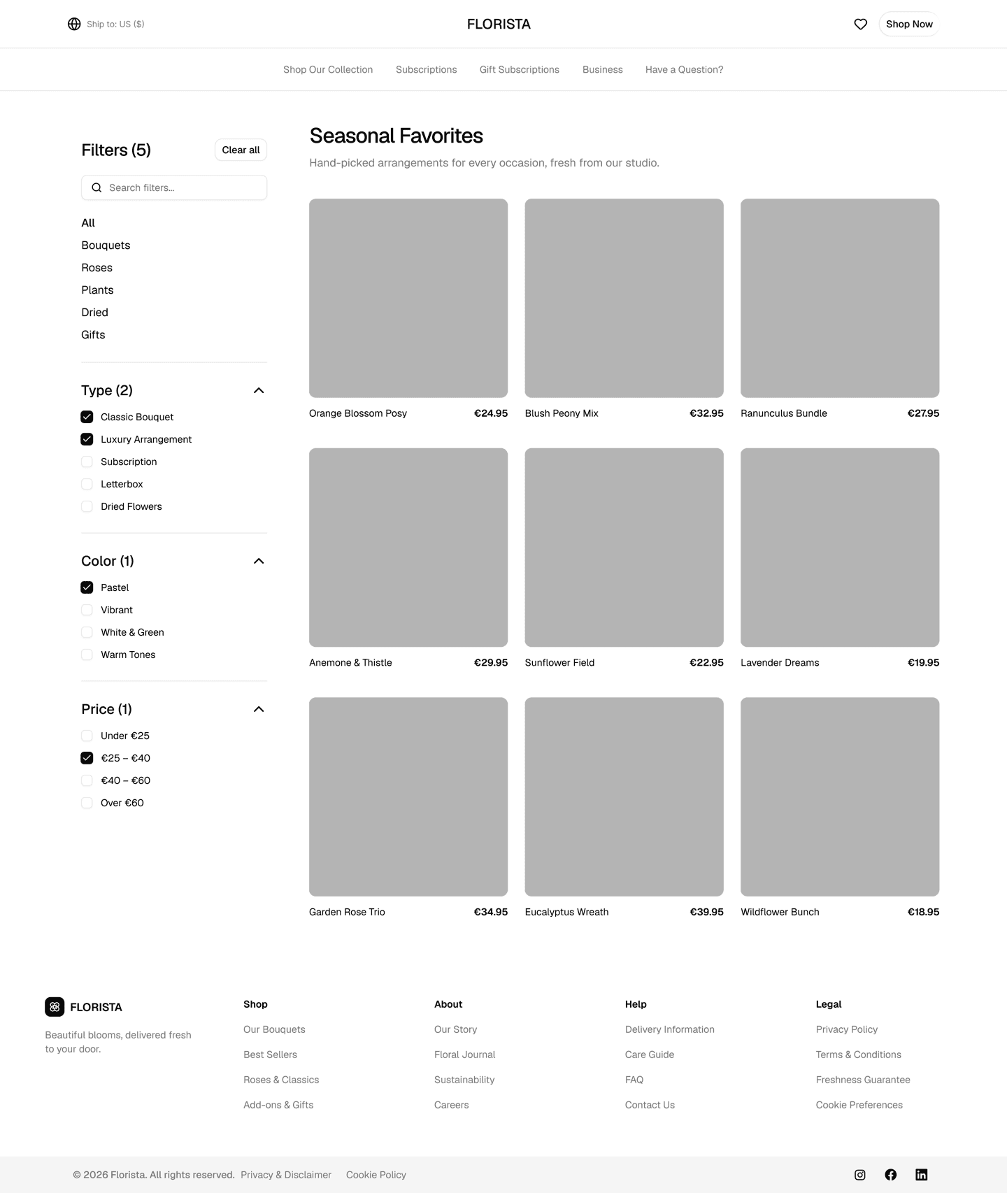
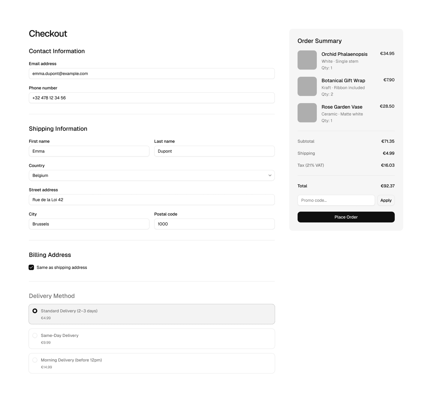
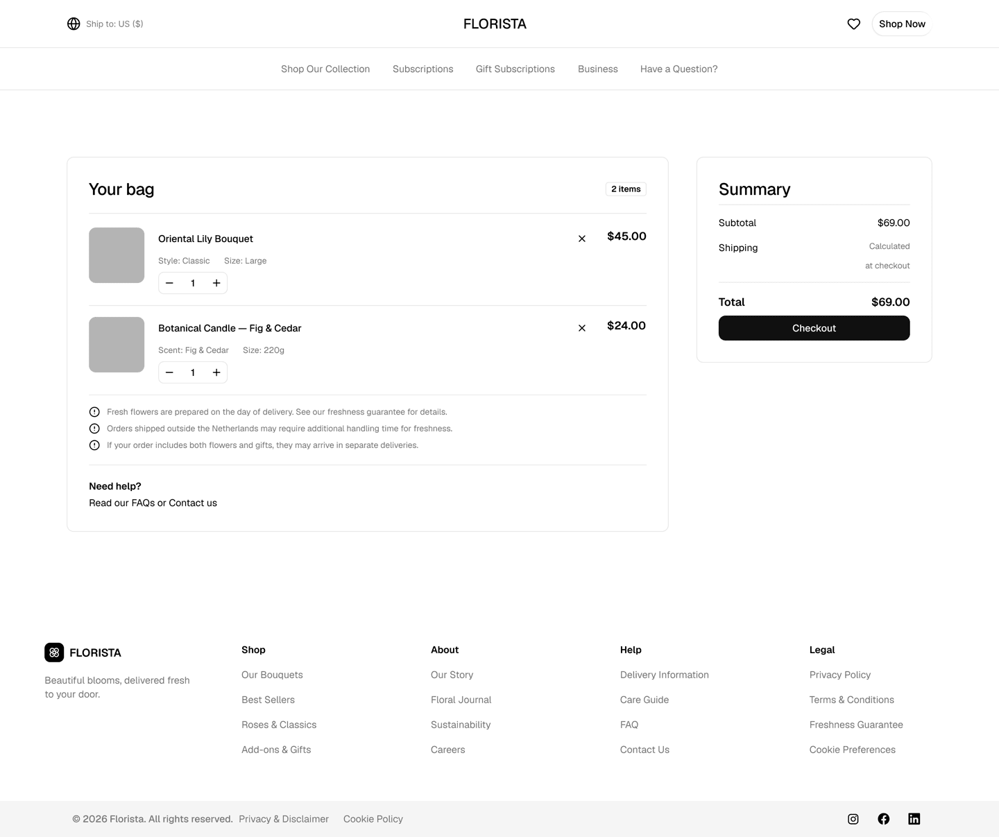
Marketing, Application, and E-commerce blocks that adapt to your theme. Available both in the Figma file and with a React equivalent. Buying the Obra Figma kit also gives you access to our private shadcn registry.
1800+ Icons & All Tailwind Colors
All Lucide icons and every Tailwind 4.2 color included. Easily switch to other icon sets like Phosphor and Tabler Icons with our shadcn/ui Create plugin.
Design to Dev
Easily move to code once you've customized your kit by exporting your chosen variables to shadcn-compatible code with our CSS Export plugin. You can also export to several token formats, including W3C Design Tokens 1.0.
Included
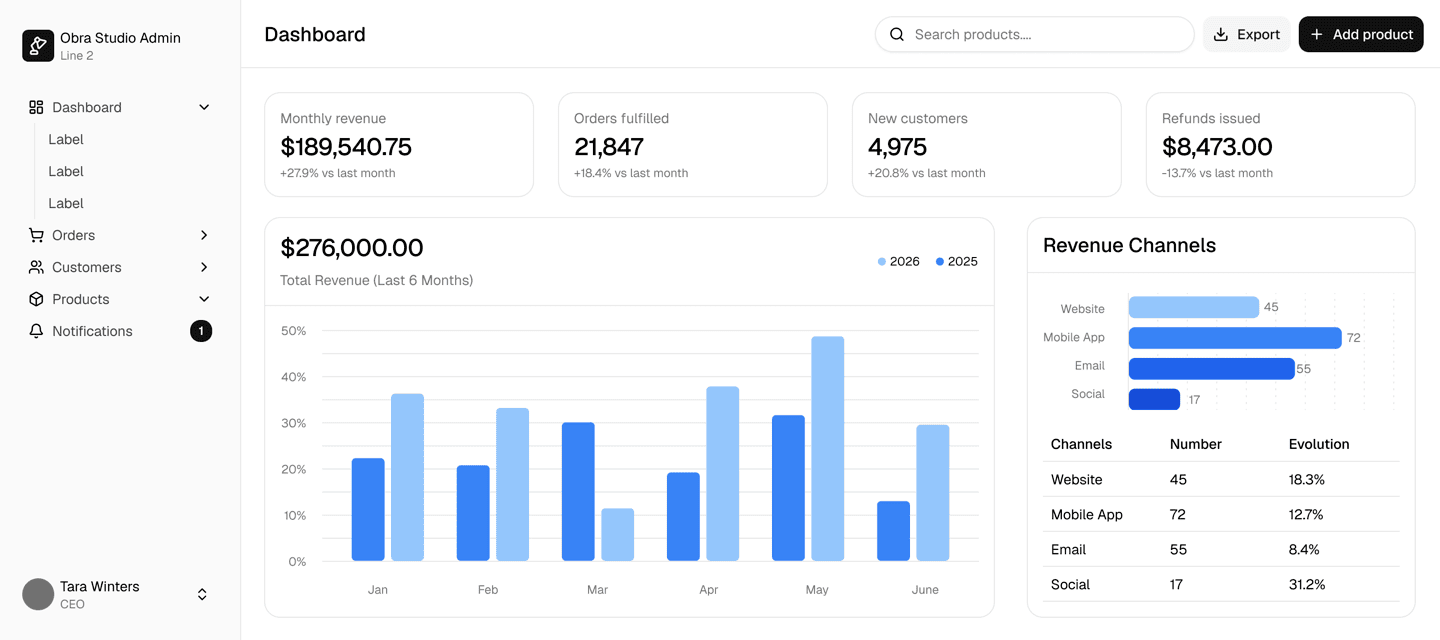
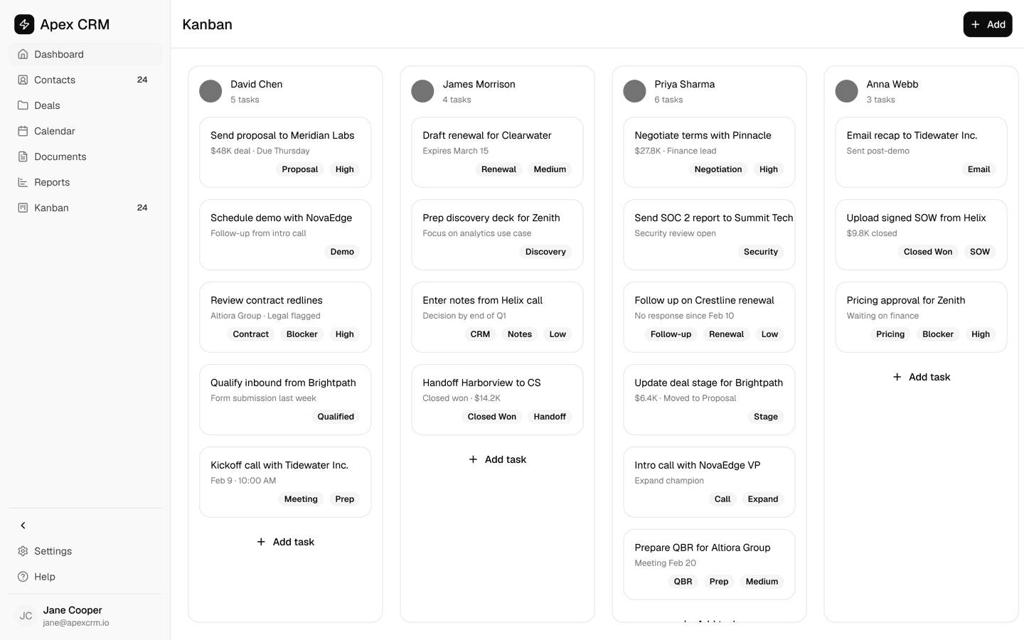
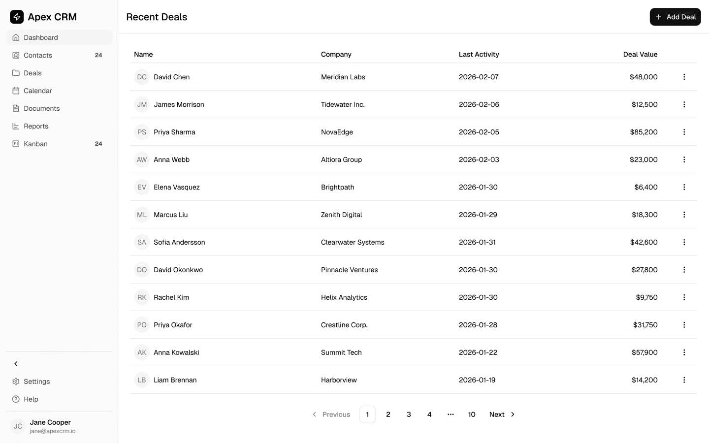
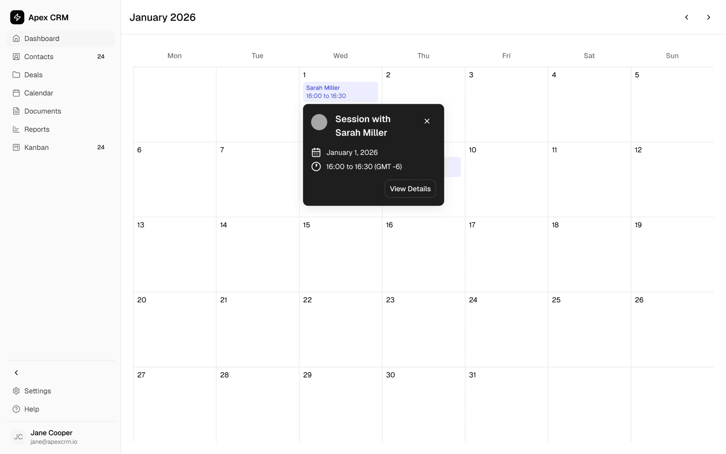
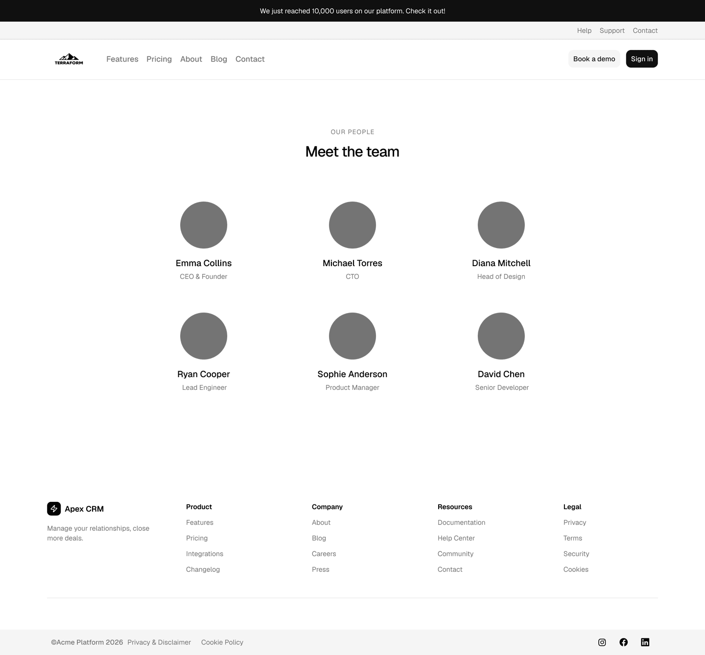
Pro Blocks
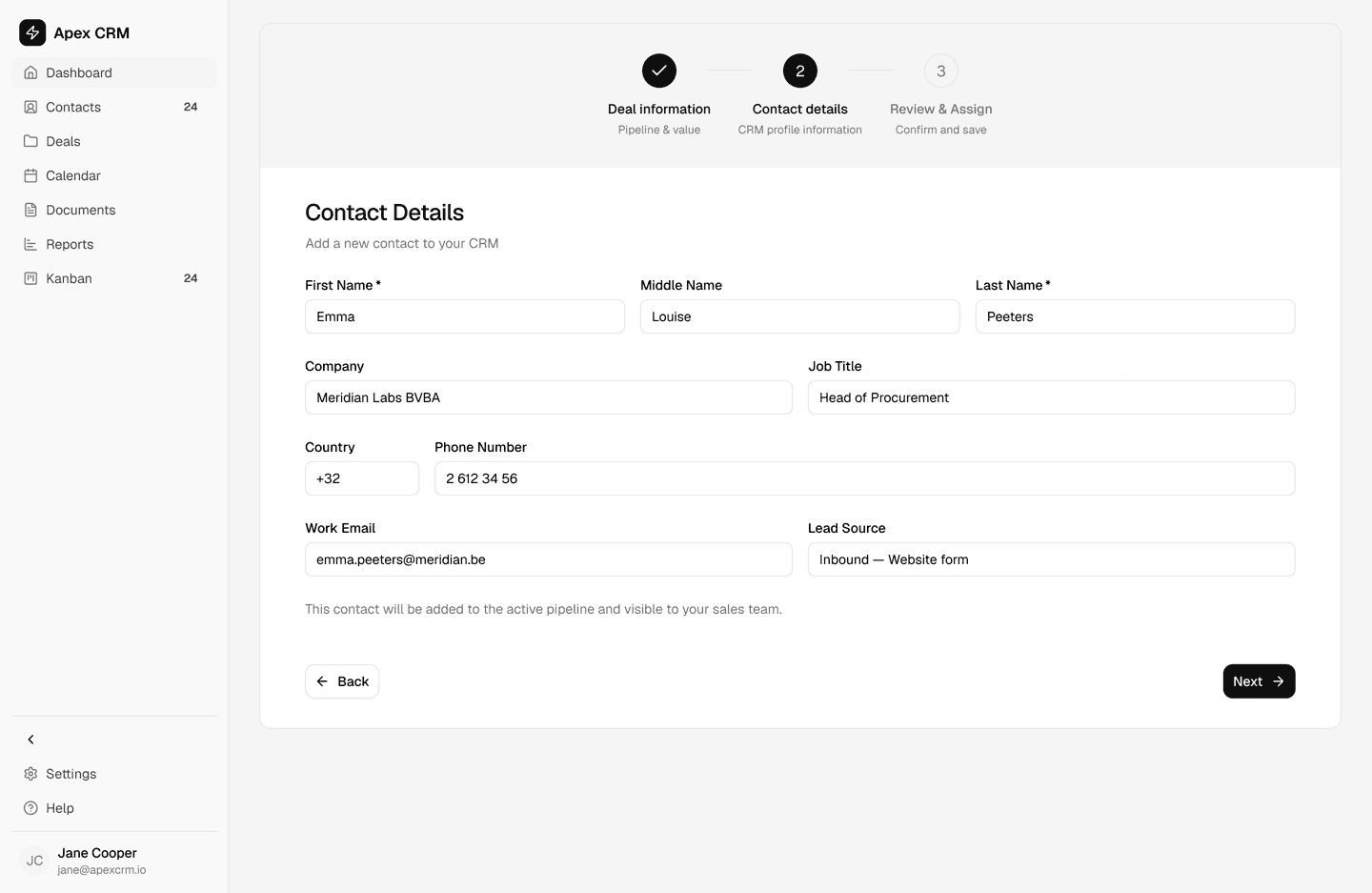
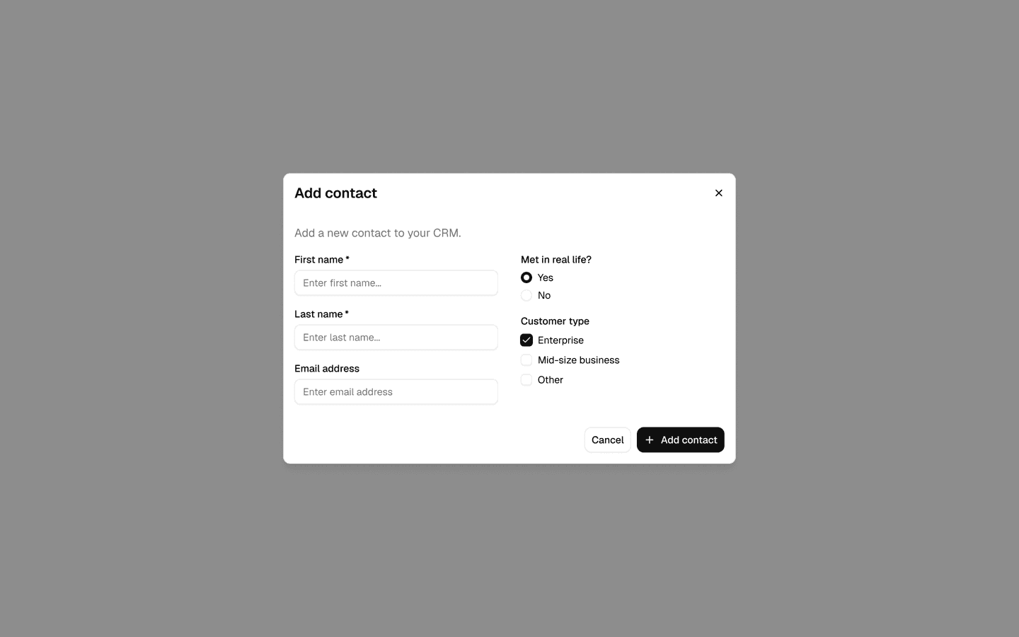
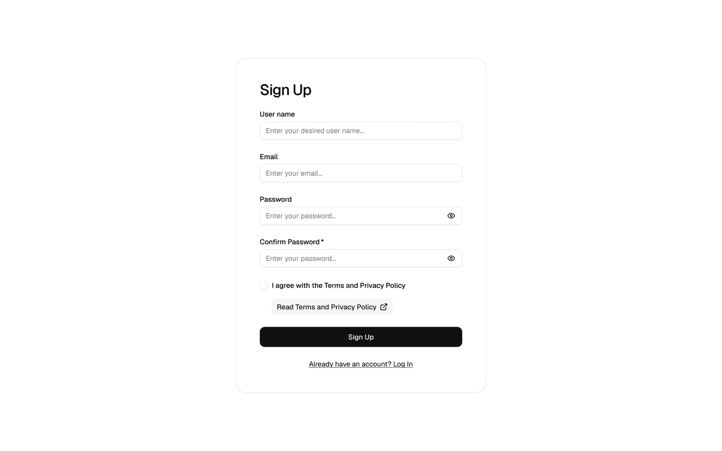
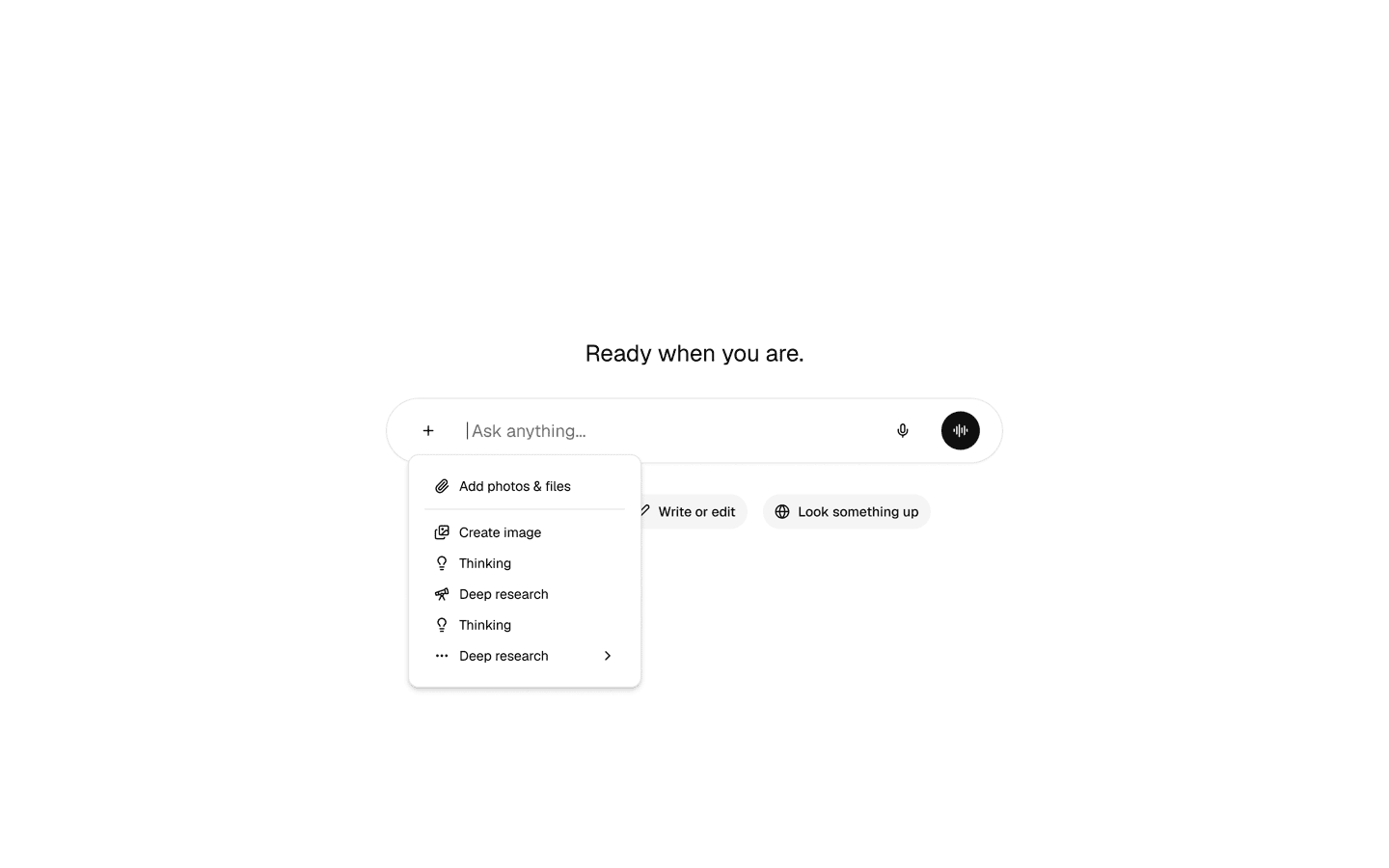
Get your work done faster with Pro Blocks across 3 categories. Here's a preview — the kit includes many more blocks ready to use.
What's next & what we shipped
Roadmap
Coming soon
Onboarding & tutorials
Learn how to get started with the kit through quick video tutorials to get you up to speed. Learn specific tips to customize your design system.
Coming soon
Agent skills
Skills and MCP tooling to drive the kit directly from your coding agent — generating and editing designs that follow the kit's conventions.
Coming soon
Improved e-commerce blocks in Figma
We are revamping our e-commerce blocks in Figma with more blocks and improvements to existing blocks.
Coming soon
Improved Pro Blocks for React
A pass on the React Pro Blocks with improved e-commerce blocks, bringing them up to the same quality bar as the Figma versions.
As shadcn/ui may change direction, our roadmap may adapt accordingly. We aim to provide the most value but can't predict where shadcn is going.
FAQ
- All shadcn/ui components
- 70+ Pro Blocks across marketing, e-commerce, and application UI — fully built with shadcn/ui variables, ready to copy-paste and customize
- Lifetime access and access to all future updates
You also receive an authentication key to download the React versions of the Marketing and Application Pro Blocks from our private shadcn registry — see the Pro Blocks developer tutorial for setup.
Enterprise and Organization licenses also include the source code of the CSS Export plugin and the shadcn/ui Create plugin, so your team can extend them and install them locally.
Yes — and this is one of the kit's biggest advantages. Figma Make uses shadcn/ui under the hood by default for most UI generation, which means feeding it a customized shadcn library is extra powerful: Make already knows the component API, so once it picks up your tokens, variants, and brand styling, every screen it generates comes out on-brand without extra prompting.
To wire it up: customize the Obra shadcn/ui kit in Figma, publish it as a library, and enable that library inside Figma Make. From then on, Make will read your shadcn/ui customizations — colors, typography, radii, OC components — and use them as the foundation for whatever you generate.