

Colors (1.X)
These docs cover the colors system used in kit versions 1.0.0 through 1.13.x — first the 1.0.0–1.7.0 system below, then the 1.8.0–1.13.x rework further down. From 2.0.0 onward, the colors system was reworked again — see the Colors overview for the current setup.
Legacy docs (1.0.0–1.7.0)#
The kit’s color system was reworked in 1.8.0. If you’re on an earlier version, the accordions below describe how things worked before.
In earlier versions (1.0 through 1.7.0), the kit included all Tailwind 4 colors as Figma variables inside a single “Raw colors” collection.
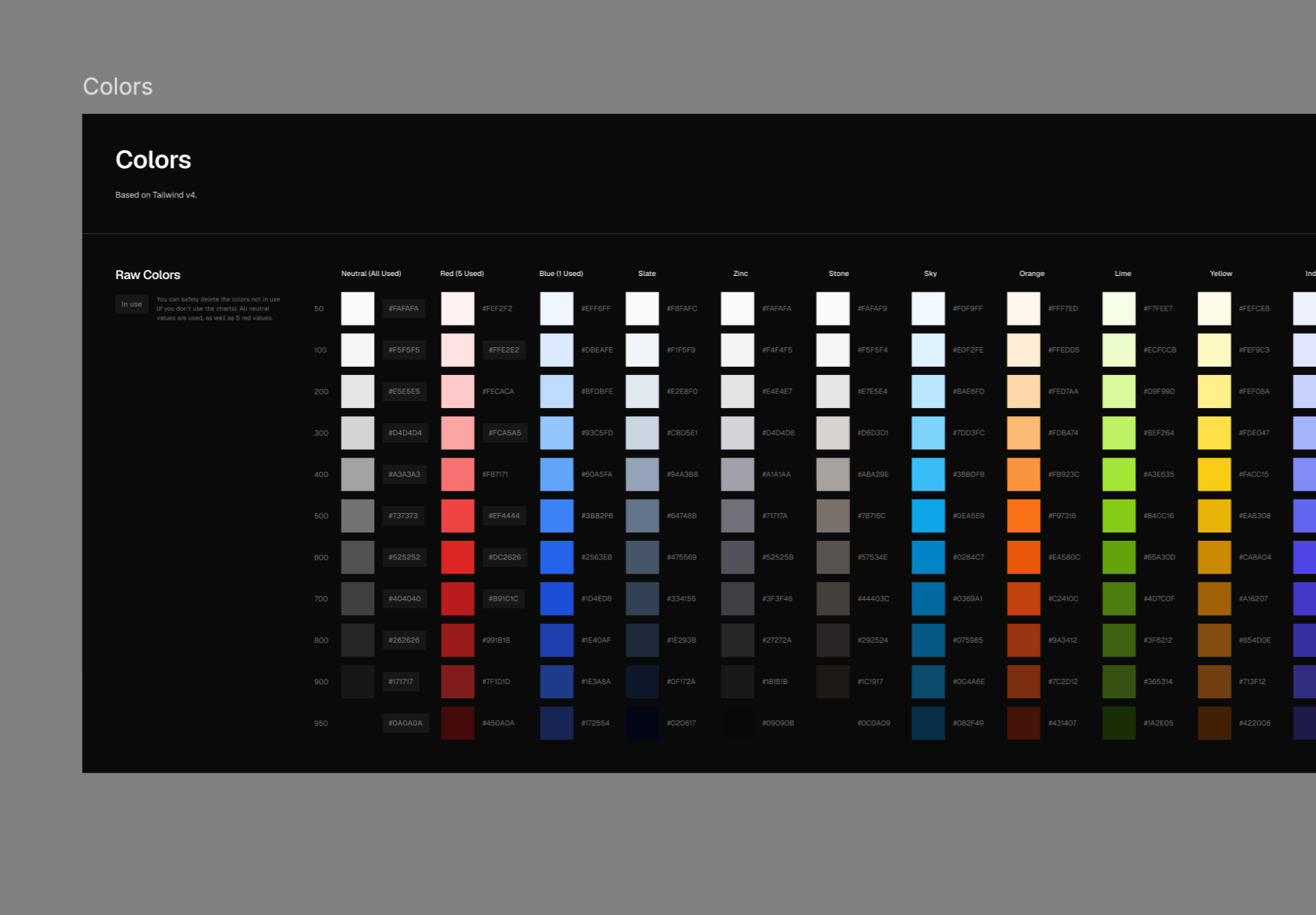
We tagged the colors in use visually on the colors page.
If you don’t need them, you can safely delete the colors not in use.
We added several variables on top of shadcn/ui’s theming to allow designers to have more control in Figma.
- Within shadcn’s code, the color mix CSS function is often used to mix a variable (or rather CSS custom property) with a color, often white or black with a specific opacity percentage. To replicate this, use the alpha variables.
- Within other parts of the code, color variables are hardcoded instead of using a theming layer. This forced us to come up with new variables for these cases. You will see many more border and background variants than exist in the official CSS, because of combinations made in shadcn docs code that need to be translated to Figma’s variable modes.
The variables that are unofficial are marked as “unofficial”.
If you inspect the kit’s variable system with a kit version from 1.5.0 on, you will see that we introduced a “brand colors” collection that includes “brand-neutrals” and “brand-shades”.
- The “brand-neutrals” collection is tied to the “semantic colors” collection automatically. You can use this to quickly change the kit to use a default Tailwind shade like slate or stone; or use it to tint your UI to your own brand’s “shades”.
- The variables in the “brand-shades” collection are unused by default on purpose, in order to make a conscious choice on which elements you would like to appear branded
We recommend, when creating custom color palettes, to first add your custom palette to “raw colors” as a group with a name (e.g. “brand-turquoise”).
You can decide to keep the Tailwind colors around in that group or remove the ones you don’t need.
Now reference the custom color palette in the brand colors collection in the “brand-neutrals” or “brand-shades” collection.
Tip: You can use a tool like Supa Pallete to generate a color palette based on your brand.
If you go into the kit and customize the “primary” shadcn/ui variable, you’ll see that your color choice propagates across a number of components. If you make your primary button red, you will also see that primary badges, checkboxes and radio buttons become red.
Depending on your brand’s color and design aesthetic, you might want to customize the colors on the component level. For example, you’d maybe prefer to have a dark primary button with the 800 shade of your bramd while having a slightly lighter badge with the 700 shade.
Maybe you have a red or orange main brand color and you’d like to not propagate that choice to form controls.
In all of these cases, it’s a good idea to start a component layer where you customize the components’ colors on a case-by-case basis.
In this section, we’d like to document the “blessed” way to customize component colors.
Add a collection called “components”. Then create a group for each component. You can use subgroups for the component states.
Generally the structure would look like something like this:
- components
- alert
- success
- background
- foreground
- error
- background
- foreground
- success
- alert
Not every brand color has a palette. Sometimes a brand color is distinct, and it doesn’t necessarily have a full palette with 11 Tailwind-like shades.
In this case, use the “brand-combinations” group of variables inside of the “brand colors” collection.
In this collection, you can find 3 default combinations of foreground and background colors.
Use this place to store specific color combinations.
For Starbucks as a brand, you’d add Starbucks green in “1/brand” and the common white foreground color in “1/ brand foreground”.
But maybe you’d also like to document other color combinations: use slot 2, 3, or extend to more combinations.
As a convention, shadcn/ui omits the word background from variable names.
The reason we don’t use specifically named variables (e.g. name the variable “Starbucks green”) is to be able to programatically access the variants, specifically in a multi-brand context. What we recommend when working with named colors is to first add these to a collection that sits “below the line” (below the --- separator). The collections below the line are not meant to be published or used programatically.
Foreground
In general, use foreground for text and icons.
We prefer to use foreground alt (Unofficial) for body text. This is not part of the shadcn/ui official variables but highly recommended design-wise (shadcn does the same in their docs, just not with an “official” variable)
Use foreground muted for muted text.
Backgrounds
A shadcn convention is to not mention that something is a background. So for example “Primary” is actually “Primary background”. We follow this convention.
Accents map to darkness levels where 1 = 100, 2 = 200 etc, with the exception of Accent 0 which maps to neutral-50 in light mode by default.
- Accent 0 - Unofficial - Maps to neutral-50
- Accent (1): maps to 100
- Accent 2: maps to 200
- Accent 3: maps to 300
You might encounter some backgrounds set to very light colors such as 0.01%. What’s up with that? The underlying reason is that without a fill, the shadow (usually used for focus styles) doesn’t render.
Borders
Borders maps to darkness levels: 1 maps to 100, 2 maps 200 etc.
- Border 1: maps to 100 (unofficial)
- Border (2): maps to 200
- Border 3: maps to 300 (unofficial)
- Border 4: maps to 400 (unofficial)
- Border 5: maps to 500 (unofficial)
This mapping is useful when checking against the official docs: https://ui.shadcn.com/docs
| Hex | OKLCH value | Color name |
|---|---|---|
| #0a0a0a | oklch(.145 0 0) | Neutral 950 |
| #171717 | oklch(.205 0 0) | Neutral 900 |
| #262626 | oklch(0.269 0 0) | Neutral 800 |
| #FFFFFF | oklch(1 0 0) | White |
| #fafafa | oklch(.985 0 0) | Neutral 50 |
| #f5f5f5 | oklch(.97 0 0) | Neutral 100 |
| #e5e5e5 | oklch(0.922 0 0) | Neutral 200 |
| #d4d4d4 | oklch(0.708 0 0) | Neutral 300 |
To help convert OKLCH colors, you can use oklch.com.
Legacy docs (1.8.0–1.13.x)#
The kit’s color system was reworked again in 2.0.0. If you’re on a 1.8.0–1.13.x version, the accordions below describe how things worked before that rework — neutrals, shadcn theme colors, and chart colors were later folded into a single theme collection, and primary/accent moved from the shadcn theme colors 5-step scale to pointing directly at raw tailwind colors.
The theming variables are based on the shadcn/ui theming docs.
We offer both light and dark themes.
shadcn colors
The shadcn colors collection is the main thing you’ll want to customize. It contains the 27 semantic tokens that shadcn/ui components reference — background, foreground, primary, primary foreground, secondary, accent, muted, destructive, border, input, ring, and so on.
It’s configured with two modes: shadcn (light) and shadcn-dark (dark), so every component automatically picks up the right value for the active mode.
If you open the collection, each token points at a value from one of the other collections — it’s a mix of:
theme-neutrals/*(from theneutralscollection) — used for backgrounds, foregrounds, secondary, muted, borders, and similar.shadcn/*(from theshadcn theme colorscollection) — used forprimaryandaccent. We used the 5-step shadcn scale here specifically for the primary button, so the kit stayed compliant with how theming worked in shadcn/ui create — picking a primary color there generates a 5-step scale, and our Figma variables mapped one-to-one to that. The same 5-step scale was also used for the chart colors.tw-raw/*(from theraw tailwind colorscollection) — used directly for a few tokens, notablydestructive(tw-raw/red/600in light,tw-raw/red/400in dark) andbackground(tw-raw/white/tw-raw/neutral/950).
To reskin the kit: change primary to retint buttons, checkboxes, focus rings, and other accented elements in one step; change accent to brand your menus, links, and subtle highlights; change destructive to match your brand’s error/danger color.
To flip the neutral tone of the whole kit (e.g. switch from neutral to stone, slate, zinc, etc.), you didn’t touch shadcn colors at all — instead you remapped the values inside the neutrals collection.
Raw colors (source palettes)
Two collections acted as the source palette:
raw tailwind colors— the full Tailwind 4.2 palette on the standard 11-step scale, published by default.shadcn theme colors (unpublished)— the tighter 5-step scale that shadcn/ui uses for its own theme tokens, feeding intoshadcn colors.
Default usage
neutralswas mapped totw-raw/neutral.shadcn colorsreferencedneutralsfor foreground/secondary/muted/border tokens, usedshadcn/*values forprimaryandaccent, and pointed directly attw-rawforbackgroundanddestructive.
Colors and the CSS Export plugin
The plugin exported shadcn colors as the theme and chart colors as --chart-1 through --chart-5 separately. neutrals and alpha were excluded from direct export since they fed into shadcn colors through aliases — same for raw tailwind colors and shadcn theme colors.
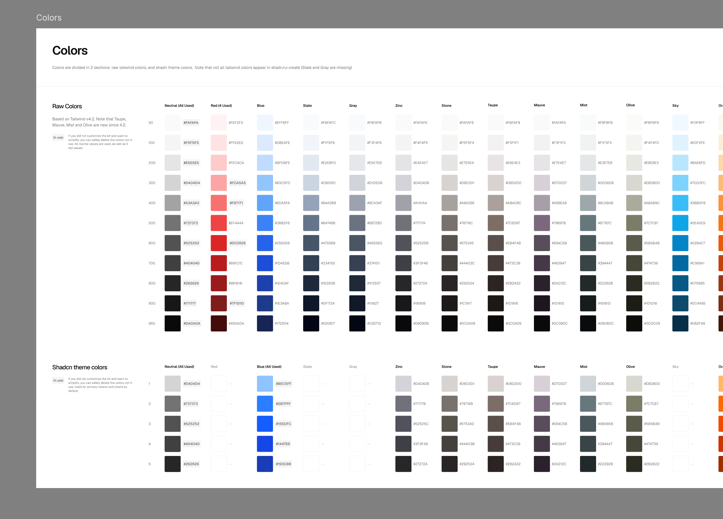
How to change the primary button color
The primary button used the primary token in the shadcn colors collection, which pointed at a 5-step scale from shadcn theme colors.
- Open the
shadcn colorscollection and find theprimarytoken (andprimary foreground). - For both
shadcn(light) andshadcn-dark(dark) modes, pointprimaryat a different scale — for example,shadcn/blue/4in light andshadcn/blue/5in dark. - If
primary foregroundneeded to contrast the new color, update it too (commonlytw-raw/whiteor a light neutral).
All primary buttons, checkboxes, radios, and focus rings updated at once. If none of the built-in shadcn/* scales matched your brand, you’d add a new 5-step scale to the shadcn theme colors collection and point primary at it.
How to change the kit’s neutrals
The kit’s neutral tone (background, foreground, muted, borders, etc.) was driven by the neutrals collection, which contained the 11 theme-neutrals/* values that shadcn colors referenced.
- Open the
neutralscollection. - Remap each
theme-neutrals/*value to a different Tailwind neutral scale — for example, point them attw-raw/stone/*,tw-raw/slate/*,tw-raw/zinc/*, ortw-raw/gray/*. - Do this for both
shadcnandshadcn-darkmodes if you wanted both themes retinted.
How to change the chart colors
The chart colors collection held 5 values used by chart components. Like primary, they referenced the 5-step shadcn theme colors scale.
- Open the
chart colorscollection. - For each chart slot (
chart-1throughchart-5), point the value at a different 5-step scale inshadcn theme colors— for example mixshadcn/blue,shadcn/green,shadcn/orange,shadcn/purple,shadcn/redfor a multi-hue chart palette. - Update both
shadcnandshadcn-darkmodes so charts stayed readable in both themes.
Before 2.0, the kit shipped as a single style (Vega), and getting the look of another shadcn/ui style meant hand-editing variables rather than downloading a dedicated file.
You could simulate the other shadcn/ui component styles — Nova, Maia, Lyra, Mira, and Luma — by changing the variables in the kit. Some examples:
- Lyra has square corners: simulated by setting all border radii to 0 (excluding infinite).
- Mira and Lyra are very condensed styles. You could tighten the overall spacing in the spacing collection to match — all components were built with auto layout and would scale along. If you went this route, elements would change size, so you’d have to refresh the Autodocs-based documentation.
Some aspects were handled at the component level rather than through variables:
- Changing inputs to rounded: offered as both rounded and non-rounded Figma component variants.
- Changing accent color to a bright or muted color: offered as both accented and non-accented menu options as Figma component variants.
As of 2.0, this is no longer necessary — Pro customers can download a dedicated Figma file for any of the 8 styles directly from the customer center. See the current Tips page for the up-to-date guidance.